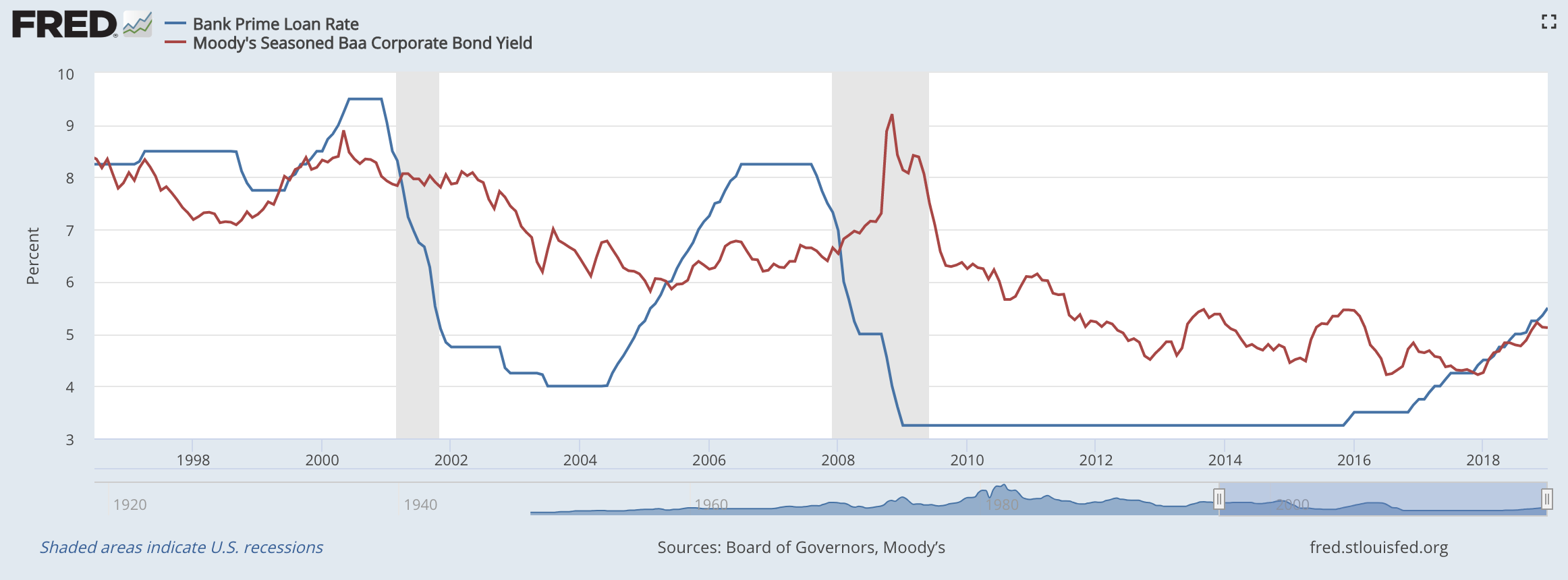
Unsurprisingly, the Fed finally got the message from the markets and pulled a hard 180 last month. In a very short six weeks, they went from “balance sheet runoff on autopilot and more rate increases to come in 2019” to “we’re pausing rate increases and we’ll be flexible with the balance sheet.” Risk assets have…
How the Economic Cycle Impacts your Portfolio: Shifting to the Next Stage
There’s a general playbook for investing when it comes to the macro-economic business cycle. The cycle includes four stages: Reflation, Recovery, Overheat and Stagflation. You might also hear other terms used to describe each stage but we’ll run with these because Merrill Lynch made this nice chart for us. Within each stage, investment assets tend…
How Systematic Investment Management Can Improve Returns
I made the decision this week to switch half of our Income Allocation within portfolios to a systematic management system. As I mentioned last week, I’m not totally sold that interest rates have bottomed but there’s a strong chance that they have, marking the end of the 35 year bull market in bonds. If rates…
Chart of the Week: Index vs Active Fund Flows
Here’s an interesting chart showing the cumulative change of money going into index funds and coming out of actively managed funds over the last 15 years. I’ve commented in the past on indexing. In short, I think it makes sense in some instances but not in others. Most of my concerns revolve around stock index…
Update on Quarterly Earnings Season & the Election
We’re in the heart of companies reporting their Q3 earnings and it’s been a bit of a mixed bag. There are a handful of small pockets doing well (cloud related services, electronic payments, cybersecurity, etc.) but overall I would sum it up as stagnant. The consumer is hurting from rising costs like healthcare while incomes…
Chart of the Week: US Interest Rates vs. Japanese Rates
Here’s a chart I saw over the weekend comparing the current path of the US Federal Funds Rate (blue line) to the path of the Japanese Policy Rate (red dotted) 16 years ago. The United States is not Japan. But our demographic structure today is very similar to Japan’s 15-20 years ago, and demographics ultimately…
Chart of the Week: Stocks as Bond Proxies
This week’s chart comes from yours truly. For much of the year, and especially so since Treasury yields broke to new lows after the Brexit vote, the “safe” high yielding stocks like Utilities, Consumer Staples and Telecom have been tracking daily changes in the bond market – not the stock market. If bond yields move…
Why there is Confusion in the Markets Right Now
Stocks have had a pretty bumpy ride over the last three weeks, with the S&P 500 falling exactly 10% from the September 19th high. The S&P 500 cash index, which is what you see quoted on TV and in the paper, fell almost 9.9% but the S&P 500 futures fell exactly 10.0% and turned on…
