Everyone knows what it means when something is superior to something else. In this post, I’ll try to explain how I view potential investments in terms of superiority and what a superior investment looks like to me. Let’s say we’re looking at 3 potential investments: A, B & C. If B is superior to C…
Chart of the Week: One Way I “Time” Buying & Selling Decisions
I haven’t posted anything on the blog lately because there hasn’t been much to talk about in terms of new updates. Overall, things have been playing out “to a T” this month, following the same playbook as back in October/November (you can read about it here). Early April is when we’ll start to see whether the analog will continue…
Chart of the Week: Negative Government Bond Yields
Here’s a chart from an article on Bloomberg today illustrating the yield curves of Japanese and German government bonds (the article is worth reading). You have to lend money for 9 years to Germany and more than 13 years to Japan if you want to earn a positive yield to maturity! Some 29% of developed-nation government…
A Case of Deja Vu
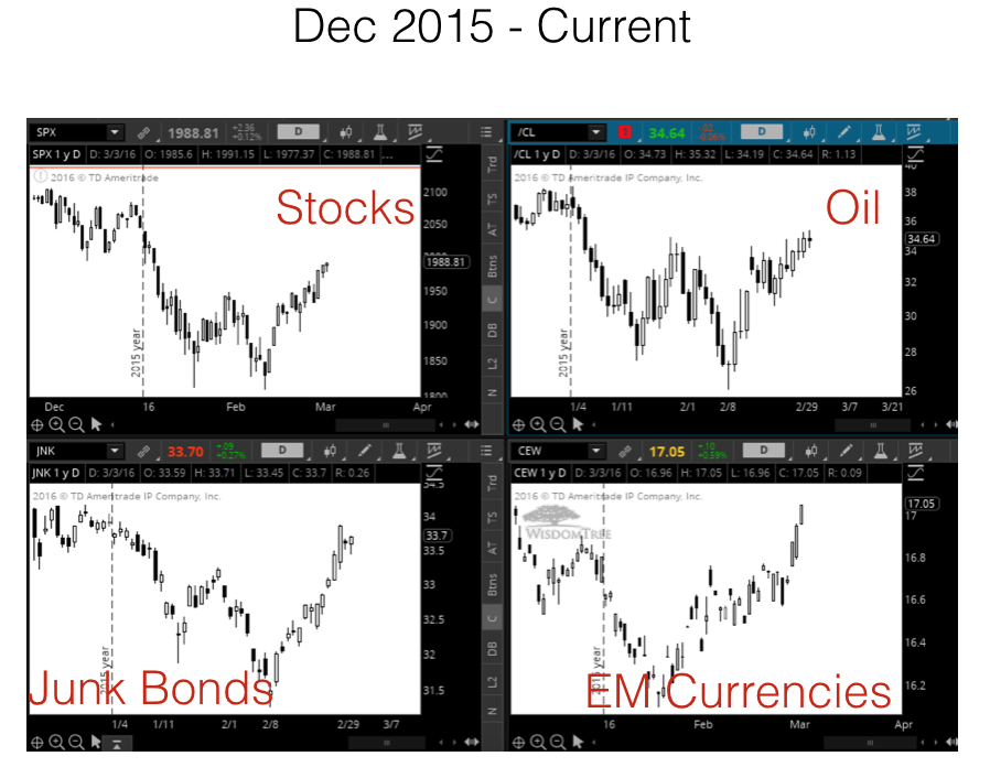
The move in the S&P 500 since January 1st (the selloff, bounce, weak test of the lows and a big surge afterwards) has been so eerily similar to the Aug-Oct move a few months back that it’s a little weird… Even the multiple 2-day retracements in the middle of the surge. The August selloff unfolded after…
Why Recessions are Necessary for Growth
Why has the economy been stagnant since 2008? Not the stock market…the real economy: real growth, higher wages, etc. Because we never let the system clear itself of waste, excess, inefficiency and poor investment decisions. I think a good analogy to explain this concept is to think of the economy like a balloon. In order…
High-Level View of Today’s Global Economy & Markets
Here’s an article from the Financial Times earlier this month that pretty much sums up the current state of the global markets. I think an easy way to envision our global financial system (a credit-based fiat system) so that it’s easier to understand is to think of it like a balloon. When credit is easy and liquidity is being…
Chart of the Week: Not a Good Sign for Global Stock Markets
The chart below was going around a lot last week. It shows a composition of AP Moller-Maersk (the world’s largest container shipping company) and Sotheby’s (the auction house of high-end art, etc.) in blue vs. the MSCI World Stock Index in orange. That’s a pretty tight correlation and a pretty wide gap we’re seeing right…
What Drives the Trajectory of Stocks
With high growth companies leading this recent downturn in the stock market, I thought it would be helpful to explain what drives the direction, or trajectory, of the stock market in the short-term. By short-term, I mean over the next year or so. The trajectory of a stock is the second derivative of the company. We…

